- Relief printing
- Intaglio and planographic printing
- Color printing
- Bits and pieces
- Early photography in silver
- Non-silver processes
- Modern photography
- Color notes
- Color photography
- Photography in ink: relief and intaglio printing
- Photography in ink: planographic printing
- Digital processes
- Where do we go from here?
Duotone letterpress halftone
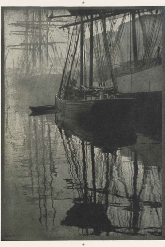
Halftone duotone print. Alvin Langdon Coburn. The Spider’s Web. c. 1905. 10 1/4 x 7" (26 x 17.8 cm). The Museum of Modern Art, New York. Gift of Richard Benson. An untrimmed proof sheet for a plate in Camera Work 21 (January 1908). This duotone shows the register marks at top and bottom that guided the printer in aligning the two impressions.
The simple halftone aspired to be upper class and to work as a luxurious method for making beautiful photographic reproductions. Its primary limitations were in the dot size—always coarse enough to be visible to the eye—and short tonal scale, imposed by the difficulties of inking and printing a delicate relief plate. A third problem with the halftone was the absence of a single halftone negative accurately rendering the full tonal scale of the photograph. The smooth, even steps of tone in photographic prints became a rough, erratic set of gradations in the simple dot-constructed halftone. A partial solution was to print a picture in more than one impression, using two different halftone negatives made by photographing the original print twice. The technology wasn’t too complicated; it required negative images that were of identical size, which was easy when glass plates were used.
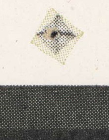
Detail of Halftone duotone print. Alvin Langdon Coburn. The Spider’s Web. c. 1905. 10 1/4 x 7" (26 x 17.8 cm). The Museum of Modern Art, New York. Gift of Richard Benson. This letterpress duotone was printed with two colors: a black and a pale green. The green is nearly invisible when examined with a magnifying glass, but gives a distinct green cast to the print. The register mark, never cut off this proof sheet, shows the two inks and their respective screen patterns.
When one halftone was printed over another a terrible pattern could form called a “moiré,” which was a frequency-interference pattern between the screens if they were not exactly aligned. This problem was avoided by tilting one screen thirty degrees away from the other, a solution that had been discovered by hand engravers many years before when working with overlays of linear designs. It turned out that even without much refinement in the way the halftones were made, a two-impression reproduction, printed first in black and then in gray ink, could look far better than any single one.
The second set of dots in gray ink, even though they were pale, added body to the black parts of the picture and made the areas of middle and light values much smoother. This new development—the duotone—appeared in art books and other expensive publications where image quality was the first concern. Duotones first showed up at the start of the twentieth century and became common by the 1930s. Extremely beautiful photographic reproductions were already being made in the first half of the century by the technique of photogravure, but this intaglio medium was very expensive. The multiple-pass duotone, though more expensive than a halftone, was still far cheaper than gravure, so it had a viable role in photographic ink printing. The presses never really registered the sheets accurately when printing duotones, but the second impression, being gray, could be a bit out of alignment and still improve the reproduction. Perfect registration had to wait for the multicolor offset presses designed to print color for advertising purposes.
The Printed Picture
![]()