- Relief printing
- Intaglio and planographic printing
- Color printing
- Bits and pieces
- Early photography in silver
- Non-silver processes
- Modern photography
- Color notes
- Color photography
- Photography in ink: relief and intaglio printing
- Photography in ink: planographic printing
- Digital processes
- Where do we go from here?
Process color in offset
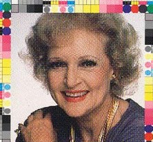
Process color in photo offset lithography. Photographer unknown. Betty White. c. 1990. 7 3/4 x 8 1/4" (19.7 x 21 cm). The Museum of Modern Art, New York. Gift of Richard Benson. This is a printer’s test sheet, used to check for slur in the image caused by slippage in the press. The enlarged halftone gives a fine demonstration of how the four dot patterns in full-color process printing interact.
Color printing was the engine that drove the development of photo offset technology. Printers had long since solved some of the basic problems of color: one was how to angle the halftone screens to avoid moiré patterns; another was to develop filters and inks that fitted each other well enough so that separations made with one filter could be printed with an ink of the complementary color. This particular problem was never fully solved, since no pure inks have ever been developed, but many darkroom tricks, using intricate masking, did a pretty good job of fixing those errors. Color printing also came to depend on the large-format transparency. These color intermediates were photographed to make the reproduction, then were available on press to guide the printing. Not many museums were willing to send their Rembrandt (or Betty White) to a printshop for the purpose of comparison.
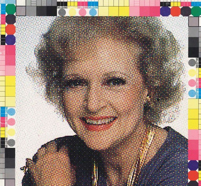
Process color in photo offset lithography. Photographer unknown. Betty White. c. 1990. 7 3/4 x 8 1/4" (19.7 x 21 cm). The Museum of Modern Art, New York. Gift of Richard Benson.
Since color was extremely complex, the preliminary or “prepress” work tended to be done in specialized houses—the transparencies were made in the field by professional photographers, and then the separations, masking, and conversion to halftones were done by the specialists. The printing took place at the companies that had the big presses. One drawback to this system was that the division of labor allowed each party involved to blame the others when things didn’t work out, as was often the case. In all my glowing descriptions I leave out the fact that the reproductions were almost always poor, whether made in color or black and white. The business of making a replica of anything is to some extent doomed from the start, and when the object being reproduced is a photograph, the job is nearly impossible.
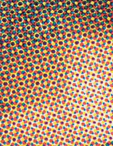
In any multiple-screen print—one that uses more than one dot pattern—some dots are next to each other and some are on top of each other. If the inks are transparent, their respective locations make no difference to the eye of the viewer when seen at a normal viewing distance. This detail shows the basic pattern of four-color process printing using traditional halftone screens.
Despite its complexity, in the end color printing turned out to be easier to do well than black and white. It’s hard to pin down the reasons for this. One big one is the development of color proofing systems that could make pretty good prepress replicas of what the halftones would do. These methods used photo polymers in the subtractive primaries; the separation house could make a set for fifty dollars or so to give the customer an idea of what the reproduction would look like. There was never an adequate method for proofing a black and white duotone or tritone. Another reason for the success of color printing was that it could be done badly and still look good. Even if the print was too heavy, or too light, or somewhat out of balance, the colors’ interrelationships could still hold and the colors could be enticing even if inaccurate. The fact that the original was seldom seen near the reproduction helped too. But in black and white work, errors in weight and scale could remove whole areas of content, and tonal distortions could murder the picture.
The Printed Picture
![]()