- Relief printing
- Intaglio and planographic printing
- Color printing
- Bits and pieces
- Early photography in silver
- Non-silver processes
- Modern photography
- Color notes
- Color photography
- Photography in ink: relief and intaglio printing
- Photography in ink: planographic printing
- Digital processes
- Where do we go from here?
Color management
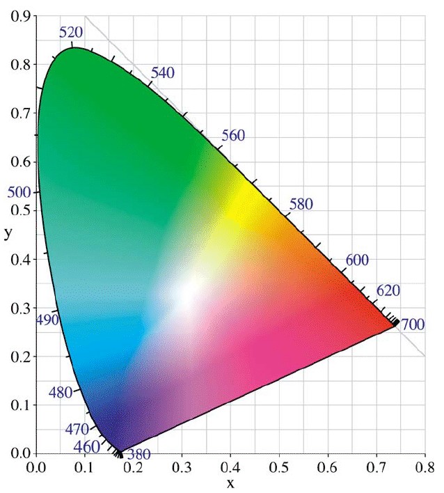
Web download. Commission Internationale L’Éclairage.Chromaticity Diagram. Downloaded 2006. 7 15/16 x 7 1/16" (20.2 x 18 cm). The Museum of Modern Art, New York. Gift of Richard Benson.
The issues of calibration have a direct impact on any photographer using the computer because the image on the monitor never looks like the print made from it. The biggest reason for this disconnect is that the monitor image is made in additive color and the print in subtractive color. The monitor literally glows while the passive print simply reflects, and each device uses a different dye set to generate the colors. It is possible to build a hood around the monitor and then make a light box around the print, so that they sit side by side and appear somewhat the same, but this ideal is seldom adhered to, and even when followed, it doesn’t address the fundamentally different colors that the two systems display. Another reason why the monitor image and the print don’t look alike is that every digital device has its flaws: both the scanner doing the input and the printer doing the output introduce errors in the data handling.
Also, the monitor, paper, and inks each have their own set of colors, which differ from one another. Technicians say that each stage has its own “color space,” and that there is no hope of making a properly balanced print unless these differences are integrated with each other through some controllable method. What has evolved to do this is a system called “color management,” which uses various “profiles” for each machine and ties the profile data from one device to the next, in a chain of information that in theory will make things turn out right. In a highly controlled laboratory setting these profiles seem to work—sort of. Since the earliest years of their craft, printers have been telling clients that the picture will look right because their methods always work out as planned, but this has never been the case. Color management is based on the premise that all aspects of the process, from scan (or original exposure with a digital camera) to print, can be controlled and that each step along the way will behave as planned. It is possible to use color-management tools to help us make a print, and we can even go to the extreme of buying expensive software to do this, but in the turmoil of technological change (and while trying to follow the instincts of an artist) I have found the system hopeless. If we make photographs and use the new technology to make them, we quickly realize that we are working in an environment similar to that of the automobile in the era of the Model T Ford. We can get great results, but things break down constantly and we have to putter with the machinery. We are a long way away from the time when we can simply turn the key and drive away, secure in the knowledge that we will get where we want to go without unexpected bumps along the way.
The Printed Picture
![]()