- Relief printing
- Intaglio and planographic printing
- Color printing
- Bits and pieces
- Early photography in silver
- Non-silver processes
- Modern photography
- Color notes
- Color photography
- Photography in ink: relief and intaglio printing
- Photography in ink: planographic printing
- Digital processes
- Where do we go from here?
Developing-out gelatin silver paper

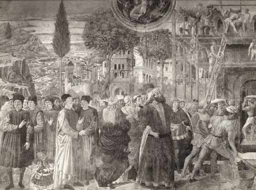
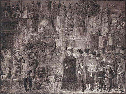
Gelatin silver print. Benozzo Gozzoli. The Tower of Babel fresco, Campo Santo, Pisa. c. 1470. 7 x 9 1/4" (17.8 x 23.5 cm). Printed by unknown photographer. c. 1910. The Museum of Modern Art, New York. Gift of Richard Benson.
The story of the dry plate hovers in the background of photographic history because at first it was used to make negatives, artifacts that are never seen by the viewing public or bought by the traveling tourist. Negatives slide back into envelopes, to be printed later for new orders or to be simply lost in the closets of amateurs. When the dry-plate chemistry moved over to the printing side of photography things really began to look different.

Gelatin silver print. Benozzo Gozzoli. The Tower of Babel fresco, Campo Santo, Pisa. c. 1470. 7 x 9 1/4" (17.8 x 23.5 cm). Printed by unknown photographer. c. 1910. The Museum of Modern Art, New York. Gift of Richard Benson.
The gelatin coating of the dry plate, put onto a paper support, produced our modern “gelatin silver paper” (as the museums call it). This material uses the latent image—no more printing out—and produces an image color that is far closer to neutral than most earlier photographic printing processes do. The papers were exposed and then had to be developed, so we can call them “developing-out papers,” or “DOP” (as opposed to the older POP, or printing-out papers).
It really wasn’t until the spread of gelatin silver papers and dry-plate negatives that the darkroom came into its own. Most nineteenth-century printing materials could be handled in room light and even the wet-plate could be manipulated under a red safelight. The new papers were in some cases as sensitive as the film was, and light-tight darkrooms became standard in photographic practice. Early in the twentieth century, dry-plate materials began to be made with full color sensitivity, and these required absolute darkness for handling films and plates. The neutral tone of the new papers caused a stir. Except for relatively rare processes such as carbon, platinum, and blueprint, photographic printing had mostly been reddish purple, and in some way the new prints didn’t seem to be “real” photographs in the way the older albumens had. The woodburytype printers had had a similar problem, and had often used purplish pigments to make the viewer think the prints were albumen. It didn’t take too long for the public assessment to shift, and for photographers and their clients to accept neutrality as the norm in photography, but we find prints from the transition period that were made the new way but toned to look like the old. The pair shown on the previous two pages is a perfect example. Both pictures were made for the tourist trade, and, because I found them together and they are of the same subject, it was assumed they were made at about the same time. Both are on modern developing-out gelatin silver paper, but the lower one has been toned—quite beautifully—to imitate an albumen print. Toning hung around for a while, but later on it tended to be done to make the prints somehow more “artistic.”

