- Relief printing
- Intaglio and planographic printing
- Color printing
- Bits and pieces
- Early photography in silver
- Non-silver processes
- Modern photography
- Color notes
- Color photography
- Photography in ink: relief and intaglio printing
- Photography in ink: planographic printing
- Digital processes
- Where do we go from here?
Japanese woodblock printing
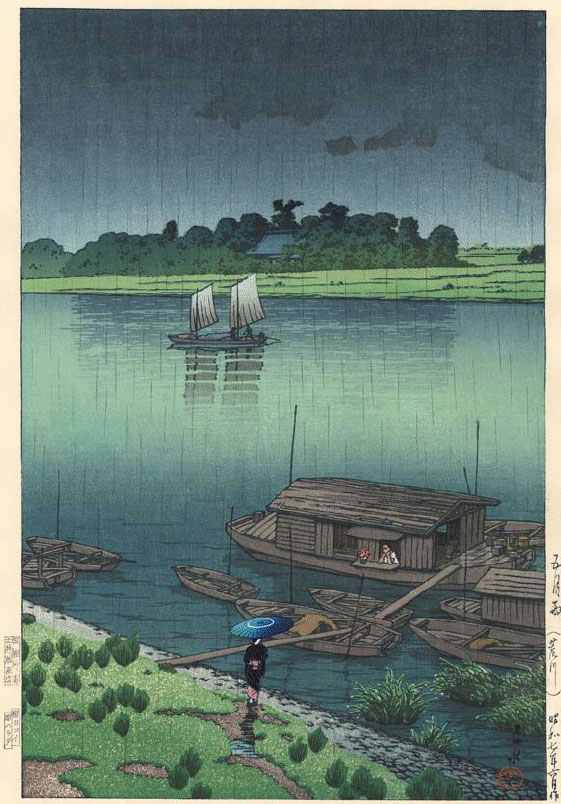
Japanese woodblock printing. Kawase Hasui. Early Summer Rain. c. 1940. 14 3/4 x 10 1/8" (37.5 x 25.7 cm). The Museum of Modern Art, New York. Gift of Richard Benson © S. Watanabe Color Print Co. and Kawase Fumiko. Japan has a long history of producing extraordinary color prints using multiple woodblocks that are inked with subtle gradations of color. The best of them have tonal and color variations whose complexity and beauty rival the watercolor paintings upon which they often were based.
Japanese woodblock prints illuminate a crucial principle of color pictures. This is that the color decisions of an artist (and in this case a printer as well) working with pigments or dyes can create a set of relationships within a picture that form the foundation of its meaning. This particular print is about two different greens, two different blues, and their interaction to produce transitional shades. The brown used in the boats, small accents of other colors, and the black key plate support these picture-defining colors, but the artist has stated the theme of the picture through the blue-green structure. This is what painters have always done with color, and this level of refinement has always showed up in the best original printmaking.
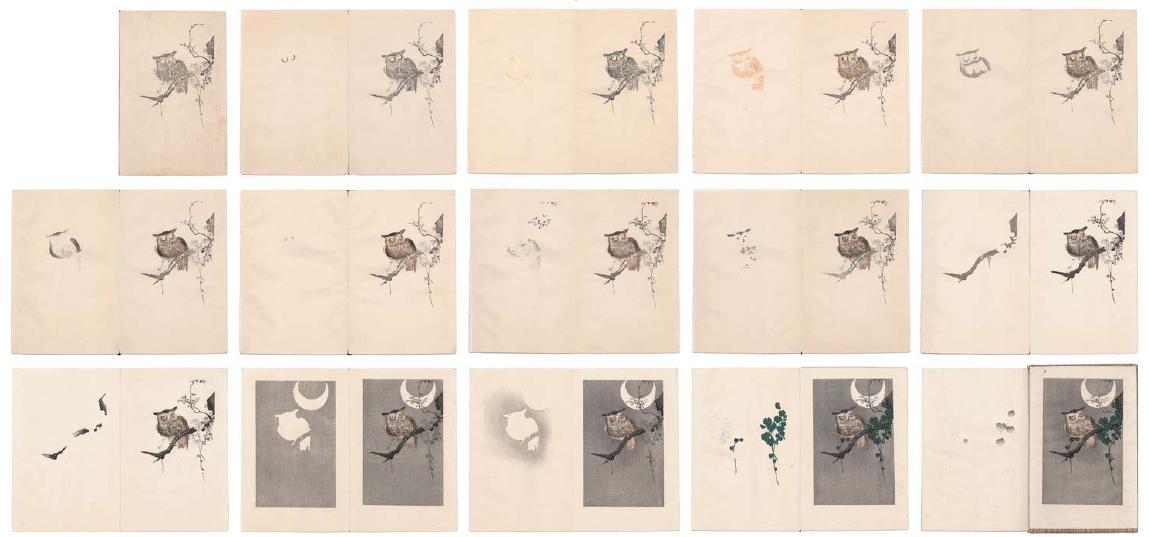
Color woodblock progressives. Artist unknown. Publisher’s process book. c. 1930. Approximately 5 1/2 x 7 1/8" (14 x 18.1 cm) each. The Museum of Modern Art, New York. Gift of Richard Benson © S. Watanabe Color Print Co. and Kawase Fumiko.
Photography, the new and dominating picture medium of our time, had no method for handling color in this way until the recent introduction of digital tools. Japanese woodblock printers would occasionally make small booklets showing the progressive stages of a single print. We see on the previous page the fifteen stages of a small print of an owl in a tree. In modern color printing, such as four-color process, each printing plate holds information for the entire picture. In handmade color such as this woodblock print, the artist has the option of making color decisions about separate parts of the picture. We see this clearly, since individual parts of the owl and the tree each have their own blocks and colors. In this print the color structure of the picture tends to be about discrete steps of tone and color rather than smooth transitions between broad areas.
The Printed Picture
![]()