- Relief printing
- Intaglio and planographic printing
- Color printing
- Bits and pieces
- Early photography in silver
- Non-silver processes
- Modern photography
- Color notes
- Color photography
- Photography in ink: relief and intaglio printing
- Photography in ink: planographic printing
- Digital processes
- Where do we go from here?
Offset duotone
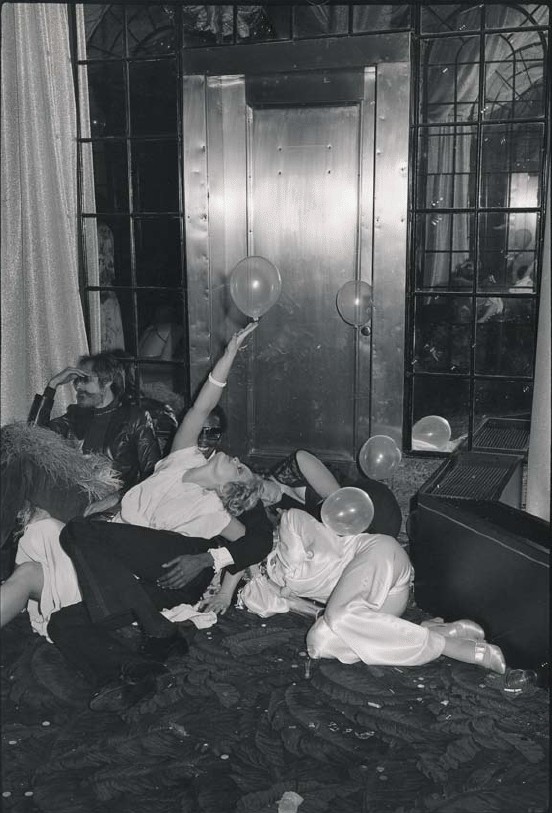
Photo offset lithography duotone. Tod Papageorge. New Year’s Eve at Studio 54. 1978. 13 1/16 x 8 3/4" (33.1 x 22.2 cm). The Museum of Modern Art, New York. Gift of Richard Benson © Tod Papageorge
The old relief trick of printing a black and white picture in two impressions was quickly adapted to photo offset lithography. The delicate touch of the blanket, and its effect of keeping water away from the paper, allowed extremely accurate registration: presses were made that could print a black layer on a sheet one day and then perfectly superimpose a gray pass on the next one. This kind of printing—called “dry trap”—also allowed strong matte blacks to be printed on soft paper. Whenever the old letterpress books had included halftones, they had had to be printed on a hard, clay-coated sheet, necessary for a smooth transfer of ink between the metal plate and the paper. Because of the softness of the blanket, offset could print on any surface, giving rise to a new, uncoated sheet—“offset stock”—that had the same appearance as the paper used in beautiful old letterpress books holding type only.
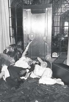
Detail of Photo offset lithography duotone. Tod Papageorge. New Year’s Eve at Studio 54. 1978. 13 1/16 x 8 3/4" (33.1 x 22.2 cm). The Museum of Modern Art, New York. © Tod Papageorge. The black impression, shown here by itself, is always printed first, because ink transfers best to an unprinted sheet and a superb transfer is required in order to hold a decent black value.
Offset presses can handle paper in big twenty-eight-by-forty-inch sheets, often with eight book pages per side, or sixteen pages in all. When folded down, such a sheet produces a “signature” in a book. Printers were initially sloppy about the tonal structure of their duotones. The early two-impression illustrations, done in the 1960s and ’70s, were tonally rich, because of the two layers of ink, but they didn’t always replicate the tones of the original very well. Gradually printers unlocked the puzzle of how to expose and develop the halftone negatives so that each color emphasized different parts of the picture scale and, once printed together, looked close to the original. In the case of Tod Papageorge's image, the black printer was made contrasty and showed exaggerated detail in the shadow portions of the picture. The gray printer showed little distinction between tones in the dark areas but had terrific accuracy in the light values.
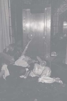
Detail of Photo offset lithography duotone. Tod Papageorge. New Year’s Eve at Studio 54. 1978. 13 1/16 x 8 3/4" (33.1 x 22.2 cm). The Museum of Modern Art, New York. © Tod Papageorge. The gray impression is printed on top of the black. Because the gray ink is transparent and lighter in value, it does not obscure the shadow detail rendered by the black printer.
In the print from the two combined, the shadow detail holds, because the gray of the second impression doesn’t bury it, and the light values are good, because there is little black ink in those areas, so the smooth gray steps are clear and accurate. This solution was necessary because there was no method for exposing and developing a single halftone negative that could accurately portray all the tonal steps from black to white. The carefully crafted duotone was a solution to this problem. When properly made, the duotone had a marvelous benefit unavailable in the darkroom: the black printer controlled one end of the tonal scale and the gray printer the other. The ink for each impression could be adjusted on press, so each end of the scale could be independently tuned. This was a tremendous control, allowing reproductions to be accurately pinned down as they were being made on press.
The Printed Picture
![]()