- Relief printing
- Intaglio and planographic printing
- Color printing
- Bits and pieces
- Early photography in silver
- Non-silver processes
- Modern photography
- Color notes
- Color photography
- Photography in ink: relief and intaglio printing
- Photography in ink: planographic printing
- Digital processes
- Where do we go from here?
James Clerk Maxwell and color

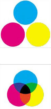
The first set of primary colors, used in painting, eventually in printing, and later still in photography, is called the subtractive primaries: cyan, magenta, and yellow.
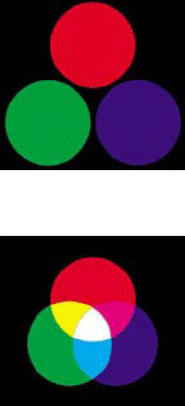
The first person I am aware of to grasp the scientific basis of subtractive printing was the Scottish physicist James Clerk Maxwell. In the mid-nineteenth century he stated that three widely spaced points in the spectrum could be chosen, and that the colors at these points could be combined in varying levels of brightness to produce virtually every color we can see. In arguing this Maxwell also made the point that there are actually two different sets of three primary colors. One set, used in painting, eventually in printing, and later still in photography, is called the subtractive primaries: cyan, magenta, and yellow. Please note that although cyan and magenta are close relatives of blue and red, they are not the classic primaries of the painters. The second set, used when mixing projected (rather than reflected) light, is called the “additive primaries,” and these are red, green, and blue. The three additive primaries with which we see—red, green, and blue—are intimately connected to the three subtractive primaries—cyan, magenta, and yellow—with which we print. The relationship between these two color sets must be understood by anyone working with photography, printing, and digital images.

The second set of primary colors, used when mixing projected (rather than reflected) light, is called the “additive primaries,” and these are red, green, and blue.
As we spend our days reading books and magazines and then looking at the computer and the television set, we move effortlessly between the worlds of print and projection (the first subtractive, the second additive). If we have any hope of photographing with digital tools, then both systems must be seen as parts of a single whole, with additive and subtractive color working together seamlessly in a system based upon six primary colors. The red, green, and blue, seen against a black background, represent what we might see if three slide projectors each had a color filter over the lens and each projected one color circle. The second image, showing these same three circles moved closer together so that they overlap, accurately describes how projected, or additive, primary colors add up: red and blue light make magenta, blue and green make cyan, and green and red make yellow. The first two combinations follow our instinctive sense of how the primaries would mix: magenta and cyan seem to be logical productions of the overlap. The third—green and red making yellow—is not intuitive at all, and remains one of the most surprising aspects of additive color.
Where all three colors overlap we see white light. This is a clear demonstration of the flip side of Isaac Newton’s great observation that white light contains all the colors, which he demonstrated using a prism. Here we see those same colors mixing together to produce white (which Newton also demonstrated). The three circles of color on a white ground represent spots of printer’s ink printed on white paper. These are the subtractive primaries—cyan, magenta, and yellow—which, when overlapped as in the fourth illustration, produce blue, red, and green. Where all three inks combine, the image is black.

