- Relief printing
- Intaglio and planographic printing
- Color printing
- Bits and pieces
- Early photography in silver
- Non-silver processes
- Modern photography
- Color notes
- Color photography
- Photography in ink: relief and intaglio printing
- Photography in ink: planographic printing
- Digital processes
- Where do we go from here?
Collotype Quirks
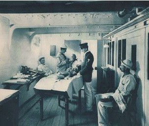
Collotype. Photographer unknown. Plate from the souvenir book U.S. Steel Cruiser Boston (New York: E. H. Hart, 1888). c. 7 x 8 3/4" (17.8 x 22.2 cm) each.
Variations in print color is one quirk of collotypes. For some reason the old collotype printers were remarkably casual about the color of ink that they used. In any given publication we can find prints ranging from neutral to brown, green, or blue. The three reproduced here, to the left and on the following pages, have been taken from a small book titled U.S. Steel Cruiser Boston, published by E. H. Hart in 1888. These prints are green and brown but the book has other plates that run the full gamut of collotype colors. When I was a young printer, and working in a shop that still did collotype, the pressmen made quite a fuss about the ink, and even in the 1960s imported it from Europe, where we all assumed it was made by grinding pigment, bats’ wings, and frogs’ legs into secret formulas guarded through the generations. Perhaps no one paid any attention to color, since getting the prints to turn out decently was such a far greater problem.
Collotype. Photographer unknown. Plate from the souvenir book U.S. Steel Cruiser Boston (New York: E. H. Hart, 1888). c. 7 x 8 3/4" (17.8 x 22.2 cm) each.
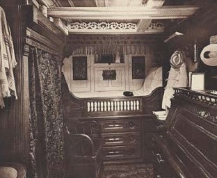
Collotype imitating albumen: Chemical photography was always expensive because the prints had to be handled individually and their materials were costly. Editions could be printed from negatives, and there was no theoretical limit to their numbers, but the reality of labor and material costs meant that any edition larger than a hundred or so required some sort of ink printing. The woodburytype filled this need, but collotype could similarly be made to imitate the chemical photograph and was less expensive. The example on the next page is from a trade magazine that describes the print accurately as a “collotype imitation silver print.” The ink has been mixed to have a purplish-red cast, to imitate the old gold-toned albumen print, and the paper is a highly polished clay-coated sheet. I had an old-time photographer tell me that if you went into a large photo studio in Paris early in this century and ordered an edition of fifty or more prints, you were just as likely to receive collotypes as actual chemical prints.
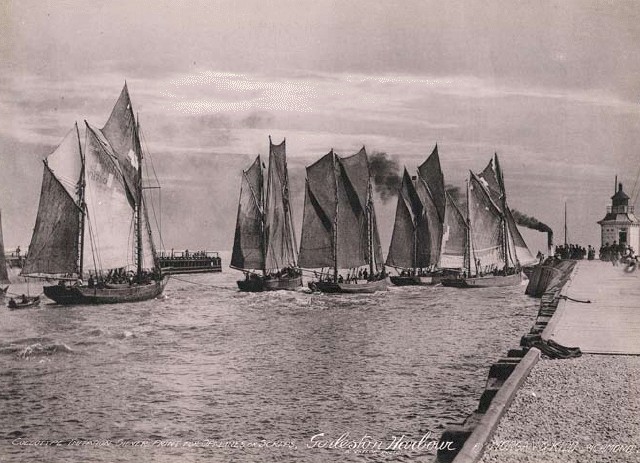
Collotype. Arthur Yallop. Gorleston Harbour. c. 1900. 6 3/4 x 9 3/8" (17.2 x 23.8 cm). The Museum of Modern Art, New York. Gift of Richard Benson. Made as a sample of the process, this collotype was printed in The Penrose Annual as an advertisement for the publisher Morgan & Kidd.
One useful collotype technique was double-rolling, used to produce richer collotype prints without the need for multiple impressions. The plate was inked with a stiff, dense black ink and then immediately reinked with a soft, colorful one. Once double-inked, the plate was printed in a single impression.
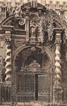
Collotype. Photographer unknown. Oxford, St. Mary the Virgin’s Church, Porch. 1900. 5 7/16 x 7 7/16" (13.8 x 18.9 cm). The Museum of Modern Art, New York. Gift of Richard Benson.
The result looked much like the later duotones printed by photo offset, which tend to have a color cast in the light values and a strong, neutral black in the deepest tone. This method was often used for fancy postcards.
The Printed Picture
![]()