- Relief printing
- Intaglio and planographic printing
- Color printing
- Bits and pieces
- Early photography in silver
- Non-silver processes
- Modern photography
- Color notes
- Color photography
- Photography in ink: relief and intaglio printing
- Photography in ink: planographic printing
- Digital processes
- Where do we go from here?
Art Photogravure
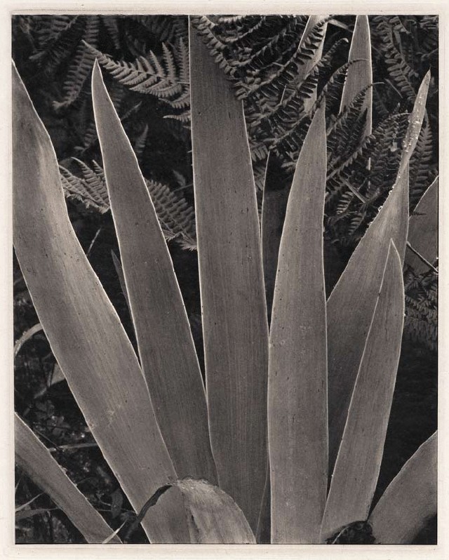
Hand gravure. Paul Strand. Iris. 1928 (Printed by Jon Goodman and Richard Benson, 1978). 9 13/16 x 7 7/8" (25 x 20 cm). Berlin. The Museum of Modern Art, New York. Gift of Richard Benson © Paul Strand Archive, Aperture Foundation, Inc.
When an aquatint was well made, it provided printing cells that were virtually invisible to the naked eye. When a gravure resist was properly etched, it not only described a full range of tones but even allowed their internal relationships to be adjusted to make the information from the negative more effective. When both these things happened in a gravure, and the originating photograph had a fine tonal scale, the result could be more beautiful than anything else in photography. Yet the tone and clarity were only part of the reason for this. Much of the glory of photogravure came from its capacity to produce a deep black value on a totally matte surface. There has long been a war between the glossy surface and the matte. It began at the very start of photography as the brilliant, ultimately glossy daguerreotype battled with the soft, matte-surfaced salted-paper print. When paper won the battle with the decisive tool of the albumen print, it did so with a semigloss surface that could reveal the long range of tones carried by the new glass wet-plate negatives. Later on, when the silver-based developing-out papers came to dominate photography and when chromogenic color papers were made, gloss surfaces won hands down.
The Printed Picture
![]()