- Relief printing
- Intaglio and planographic printing
- Color printing
- Bits and pieces
- Early photography in silver
- Non-silver processes
- Modern photography
- Color notes
- Color photography
- Photography in ink: relief and intaglio printing
- Photography in ink: planographic printing
- Digital processes
- Where do we go from here?
Black and white inkjet printing
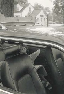
Inkjet print. Richard Benson. Untitled (child in back seat of car). c. 1990. 15 1/2 x 10 7/8 (39.3 x 27.7 cm). The Museum of Modern Art, New York. Gift of Richard Benson © Richard Benson. The question of permanence is present in every printing process. The print on the left and the print on the next page—made at the same time, on the same paper, with aftermarket monochromatic inks—started out as neutral gray. One print has turned green and the other brown. These changes might simply reflect the author’s sloppy storage, but they could also be due to inferior paper or the presence of volatile chemicals in the air. Whatever the case, some digital prints are surprisingly fugitive in color. Ink manufacturers expend a great deal of research on developing inks that do not fade, but light is corrosive for all pictures.
The metamerism problem—of prints shifting color under changing lighting conditions—is particularly bad for black and white inkjet prints. If we make a beautiful black and white print, tuned so the tones are neutral, it is disturbing to walk across the room with it, toward a window, and find the image becoming green. This happens because the bulk of the inks that make up the picture are in the subtractive primary colors. They may be carefully balanced to produce neutral tones when printed in nearly equal amounts at any one spot, but that balance depends upon a specific light source being used to view the print.
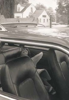
Inkjet print. Richard Benson. Untitled (child in back seat of car). c. 1990. 15 1/2 x 10 7/8 (39.3 x 27.7 cm). The Museum of Modern Art, New York. Gift of Richard Benson © Richard Benson. This print started out as neutral gray and turned brown over time.
All inkjet printers have black inks in their ink set, but a print made with just that one ink will be rough and tonally poor. The smooth values in any inkjet print come from building up the image with at least four sets of dots, each in a different ink, and only by using inks in the primary colors can we print both color and black and white pictures with the same ink set. The minute we change viewing lights, such prints can shift in color.
This difficulty can be solved in two ways. One is to use a carefully designed “RIP,” which stands for “raster image processor.” The file we handle in the computer is not the one that drives the printer. Printers differ from computers in their design, so another translation is needed: a specialized file, which we never see or manipulate, is made to create the final print. The RIP is the device that produces this hidden but essential digital printing file. When used with normal colored inks, a good RIP will make up most of a black and white image out of the black ink (some printers even add an additional gray ink), then supply tone and smoothness by printing weak arrays of colored dots as well. As the percentage of colored ink in a print diminishes, so too does the metamerism problem. The second solution is to give up on making color prints and install a set of monochromatic inks in the printer. Some companies produce these as aftermarket additions, and they can make extraordinary prints that are stable, tonally spectacular, and completely free from color shifts.
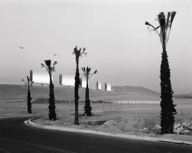
Inkjet print with monochromatic inks. Steve Smith. Las Vegas, Nevada. 1996. 10 3/4 x 13 1/2" (27.3 x 34.3 cm). The Museum of Modern Art, New York. Gift of Richard Benson © Steven B. Smith
These monochromatic ink sets use one or more black inks and various weights of gray. The cartridges or tanks in the printer are replaced with these new ones, and specialized software is installed in the computer to build print tones that match the monitor display. One of the pioneers in the development black and white ink sets Jon Cone even developed new software that lets the inkjet put down a diffuse dot, producing a print that looks truly tonal, even under the magnifying glass. A fine print made with these inks and that dot structure is as rich in grays as anything silver produced in the history of chemical photography.
The Printed Picture
![]()