- Relief printing
- Intaglio and planographic printing
- Color printing
- Bits and pieces
- Early photography in silver
- Non-silver processes
- Modern photography
- Color notes
- Color photography
- Photography in ink: relief and intaglio printing
- Photography in ink: planographic printing
- Digital processes
- Where do we go from here?
Multiple Impression Printing

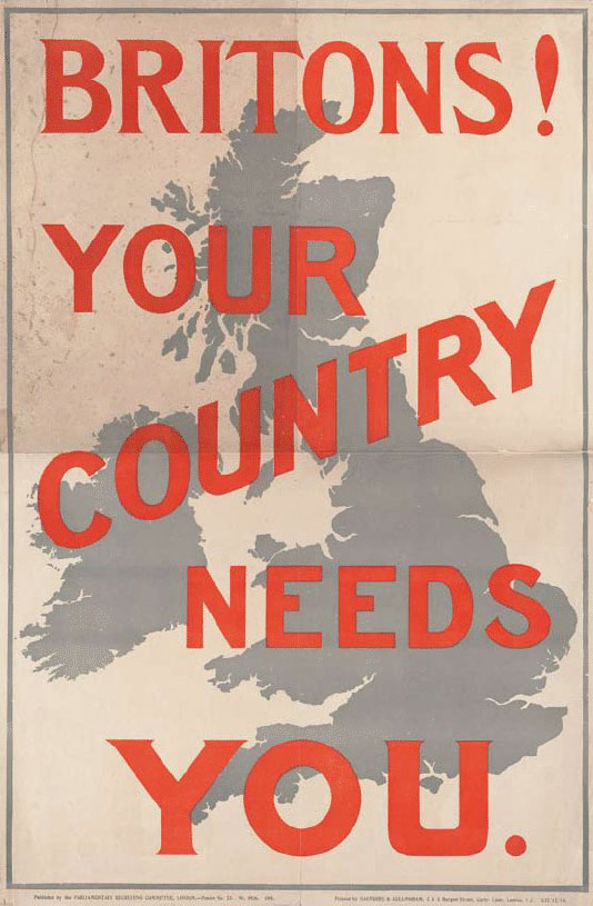
Stone lithograph. Artist unknown. Britons! Your Country Needs You. c. 1914. 28 3/8 x 18 5/8" (72 x 47 cm). The Museum of Modern Art, New York. Gift of Richard Benson. Lithography has the capacity to create broad areas of flat color, which makes it a great medium for posters.
The lithographic crayon can render delicate lines of varying shades, but the process also does something else that was new when it was invented: it produces perfectly smooth areas of even tone. Intaglio printing could not do this; there the ink was always held in small pockets, which inevitably gave some texture to the prints. Earlier relief printing had also done a poor job over large areas because the flat platens of the presses could never apply enough pressure to a large printing area. (Relief improved in this respect later on, with the invention of cylinder presses.) But lithographic presses use a scraper—a stiff leather or synthetic blade—to press the paper against the inked stone. This blade is drawn across the paper, so that, at any one point in the printing, all of its pressure is applied to a thin line beneath its working edge, allowing an even transfer of ink from stone to paper.

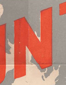
Enlargement of Stone lithograph. Artist unknown. Britons! Your Country Needs You. c. 1914.
The tonalities generated by printing this way, along with the ability to register multiple impressions, led to the beautiful lithographic posters of the nineteenth century. And the ability of lithography to print even tonal fields lay beneath its eventual adaptation to photo offset lithography in the twentieth century. Lithographs were fundamentally different from relief and intaglio prints, and they opened the door to the modern era of intricate multiple-impression printing in color. This poster, made entirely by hand around the time of World War I, gives us a crucial lesson about the challenges of registration when printing in more than one impression.
When the gray was printed, the shapes of the letters were left blank; their red ink was applied in the second impression, filling the spaces left open for them. Unfortunately the two impressions didn’t perfectly align—the registration was not accurate (and it never was)—so a white, uninked line runs down one side of the N and a dark, double-inked line down the other. The solution, called “trapping” in the printing trades, was to make the letter larger than the space it was to fit into, or to make the space it fitted into smaller. The reproduction of the entire poster shows that most of the red letters have a dark line at their edges where they butt up against the gray impression. This dark trap line is less offensive than occasional white lines would be had the image not been adjusted to create an overlap. The lesson here is that if a picture is cut up into pieces and printed in more than one impression, getting all those parts to assemble correctly on press is a technical problem. Only by adjusting the size of the picture elements can we make a print that seems to fit together properly.

