- Relief printing
- Intaglio and planographic printing
- Color printing
- Bits and pieces
- Early photography in silver
- Non-silver processes
- Modern photography
- Color notes
- Color photography
- Photography in ink: relief and intaglio printing
- Photography in ink: planographic printing
- Digital processes
- Where do we go from here?
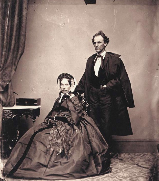
Offset tritone

Photo offset lithography tritone. Mathew B. Brady Studio. Senator and Mrs. James H. Lane. 1861–66 (Printed by Richard Benson and Thomas Palmer, 1985). A multiple-impression proof sheet for Photographs from the Collection of the Gilman Paper Company (White Oak Press, 1985). From an albumen silver print from a glass negative, 8 13/16 x 7 3/4" (22.4 x 19.7 cm). The Metropolitan Museum of Art. Gilman Collection, Purchase, Alfred Stieglitz Society Gifts.
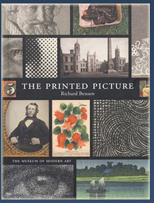
The duotone was followed by more complicated printing, in three, four, and even five colors, all to make beautiful reproductions of black and white photographs. These additional colors were particularly needed for the reproduction of photographs from the nineteenth century if the rich variety of their original chemical color was to hold. In the case we see here, a black impression was used to generate the darkest tones in the print, but then, instead of a simple gray, the other inks were warm in color to match the old purple/red of the albumen original. Early black and white photography can also be reproduced with process color (as in my book The Printed Picture), but the finest reproductions cannot be done that way.

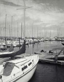
Photo offset lithography. Richard Benson. Bend Boat Basin. 1985. 9 1/2 x 7 1/2" (24.1 x 19 cm). A tritone print in black, dark gray, and light gray ink. © Richard Benson
The tritone, printing from three halftones in various shades of gray ink, does much the best job. I make this whole thing sound like a cakewalk but it is actually very difficult to do well. Reproductions never look just like the originals, and all serious ink reproduction of photographs is based on the understanding that the reproduction has to look “right” in its own context—of ink on white paper in a book. This rightness often requires that values in the original be altered in the reproduction. Many early photographs, for example, have turned quite yellow, and if this color is slavishly followed, the reproduction simply looks wrong. Printing requires an understanding of a concept of equivalence: the most accurate replica one can make of anything is seldom a literal copy, but rather a new thing that gives the viewer the impression that it looks like the original.

